The Case For Making Your Notes Hard To Read
Be clear! You probably absorbed this mantra from teachers at school. Your notes are supposed be tidy, neatly organised and easy for anyone to read. After three degrees and over five years of teaching, I disagree.
This needs to be heavily qualified, of course. I absolutely agree that your notes should be intelligently arranged and the handwriting should not be illegible. However, your notes do not need to be user-friendly to anyone who picks them up. In fact, I specifically want to argue that they shouldn’t be.
We need to get clear about our aims when we make notes. It’s generally not necessary to create a resource that lays out all the information for us. We have textbooks for that. If your note-taking strategy consists of copying out the textbook you might want to reconsider. If you wanted a word-for-word copy of the textbook, surely snapping a photo of the page on your smartphone would be quicker?
We copy out, supposedly, because it helps the information ‘sink in’ – but educational studies, such as Dunlosky et al 2013, show that verbatim or basic summaries are a very inefficient way of absorbing information. (1)
It comes back to the ‘levels of processing’ effect. (2) Although this theory of memory is not in the only game in town, there is widespread consensus that the more thoroughly we think about something, the easier it is for us to remember. Examples of ‘shallow’ processing include processing how an object looks, or the letters contained within a word. Examples of ‘deep’ processing include relating the object to something else, or examining its importance. Making notes is an opportunity to think as deeply as possible about the matter at hand. My ‘active note-taking’ technique is designed to encourage exactly this. There are five guiding principles.
1) Notes should be as abbreviated as possible.
Students are strongly encouraged to form their own codes. Although they are often subject specific, here are a few of my most commonly used ones.
→= causal relationship
↓= decreases/low
↑ = increases/high
thx = thanks to (i.e. we know this because, rather than a causal link)
¬ = negation
The purpose of this is two-fold. Firstly creating the codes requires students to put more thought into what they are writing down. Secondly, when reading the notes, students are required to already understand the subject matter, to some extent. The notes are memory-jogs, rather than a full explanation. Reading the notes is therefore an active process – it is essentially the equivalent to a ‘fill in the blanks’ worksheet, but with far more flexibility and utility than a traditional one.
2) Causal relationships should be shown whenever possible, creating a story.
This is especially important in science, history and geography, but is applicable everywhere. A list of events is never as meaningful or useful as story of what caused what. Students are encouraged to anthropomorphise electrons, neurons, prime numbers etc whenever possible.
3) Flowcharts are especially useful in mathematics.
Here is an example by a student. It shows how to use every formula about triangles necessary for GCSE mathematics. The notes outline when to use what formula in an easy-to-use format.

The first question is whether the triangle is right angled. If so, then SOH/CAH/TOA and Pythagoras' theorem become relevant and we should look at the left of the flowchart. If not, we're left with the Sine, Cosine or 1/2abSinC formulae. Whether we use sine or cosine is decided depending on the concept of 'in play'. 'In play' is first defined as when exactly one of these is unknown. For example, if three sides are known and we are trying to find an angle, then 3 sides and 1 angle are 'in play'.
4) Information should be arranged by relevance and causal relationship.
Mind-maps do tend to be the default, since they give more freedom – but intelligently arranged linear information can also be fine. Colours should be used not simply as decoration but to show relationships between items.

These are just some hastily scribbled lecture notes, but the green circles denote 'chunks' of rock we have actually been able to investigate, while the orange shows geophysical methods we have used to investigate the interior of the earth.
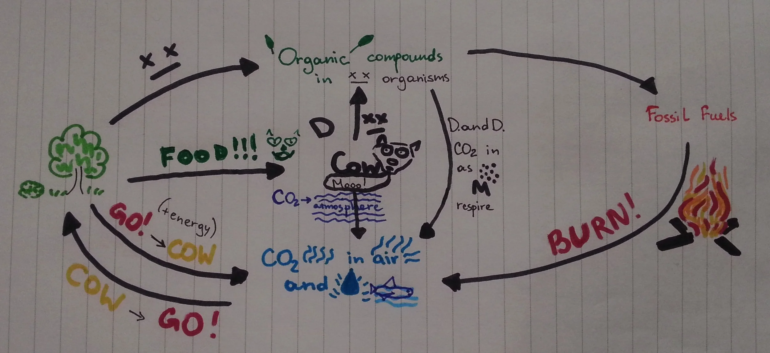
5) Diagrams, pictures and jokes should be used whenever possible
By drawing the concepts you're forced to think from a different perspective. The more thinking you do, the higher the processing, the better the retention! Additionally, the notes will be more fun and interesting to make, which itself will be helpful. A prime example can be found in the notes at the top of this page. The notes depict the carbon cycle through a series of pictures and abbreviations. GO->COW stands for Glucose + Oxygen -> CO2 + Water, for example. The notes are not only eye-catching, but downright hard to read. Simply reading through them is a revision exercise in itself.
A more subdued example:

These notes contain everything you need to know about chemical bonding at GCSE level. Notice how around 10-15 pages of a textbook have been condensed to one sparsely filled side of A4. Causal relationships are indicated e.g. the fact that covalent molecules are discrete causes their low melting point. A memory aid is used for cations and anions (cats are good, i.e. positive, so cations are positive). If you don't already know about chemical bonding, then the notes are likely gibberish to you. This is working as intended - the writer/reader should be filling in the gaps themselves, and an inability to comprehend the notes is a good indication that the material needs to be revised more thoroughly using the textbook.
Take Home Point About Notes:
Find innovative ways to display information; both reading and writing notes should really test your understanding of the material.
References
1. Dunlosky et al, 2013. Improving Students’ Learning With Effective Learning Techniques: Promising Directions From Cognitive and Educational Psychology, Psychological Science in the Public Interest 14(1) 4–58
2. Explorable.com (Jun 9, 2011). Levels of Processing. Retrieved Jul 27, 2014 from Explorable.com